2번째 프로젝트 제목은 "Progress Steps"다.
진행 정도를 나타내는 기능인데, 검은색 테두리로 이루어진 원 4개가 검은선으로 이어져 있는 상태에서, "Next" 버튼을 누르면 다음 원까지 선이 진행되었다는 의미의 파랑색으로 변했고, "Prev" 버튼을 누르면 이전 원까지 파란선의 길이가 줄어든다.
이 기능도 어느 웹사이트든 자주 사용되는 거여서 열심히 들었다.
일단 결과물부터 보자!
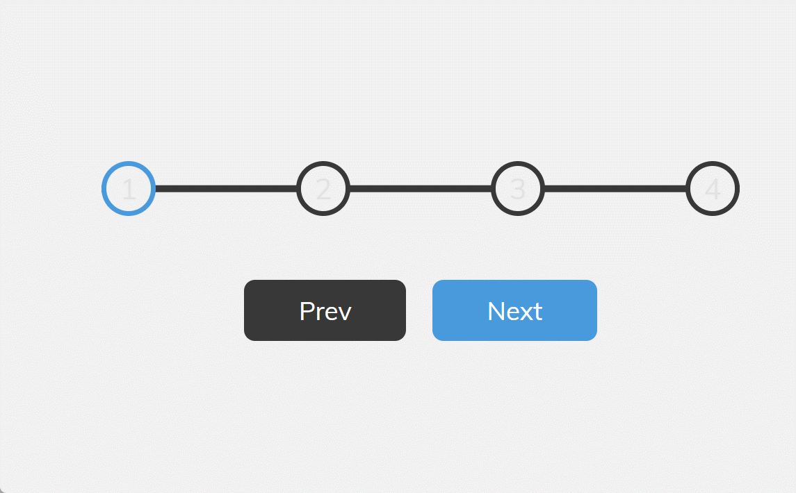
이번 프로젝트 난이도는 이전 "Expanding Cards"보다 어려웠다.
원을 만들고 원 사이에 선을 하나 긋는다는 게 말은 쉽지, 코드로 구현하려니 갑자기 머리가 안 돌아갔다.
결국 또 다시 시작되는 정보 찾아 삼만리... 인터넷 줍줍을 시행한다!
크기를 10px에서 30px로 늘리는 등 이리저리 강사의 코드를 하나씩 뜯어보면서 어떻게 적용되는지 분석했고,
어느 정도 시간을 투자하니 전체적인 코드가 눈에 들어왔다.
기본적인 원리는, 원 4개 아래에 긴 직선을 놓고, 긴 직선에서 파란색 선의 길이 비율을 next와 prev 버튼 누를 때마다 변화 주는 것이다.
강사님의 코드를 이해한 후, 바로 응용 실습에 들어갔다.
내 계획은 간단했다.
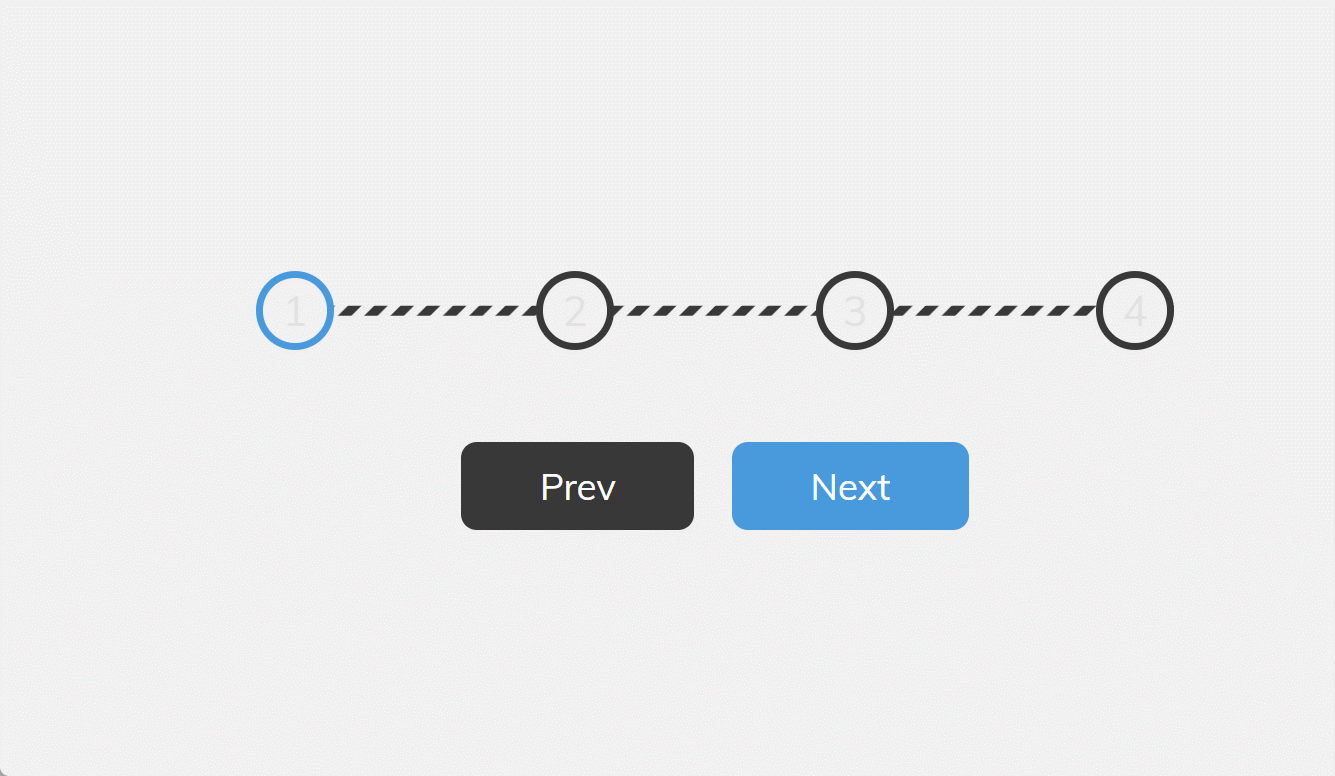
그냥 progress line을 지그재그 줄무늬 선으로 바꾸면 되는데... 역시 생각처럼 쉽게 되지 않았다.
이리저리 시도하다가 실패했고, 결국 인터넷 검색해서 쌩쇼를 한 후에야 구현 성공했다.
지그재그 묘사에 있어서 요지는 바로 linear-gradient 함수를 사용하는 건데, 이 CSS 함수는 두 개 이상의 색상이 직선을 따라 점진적으로 변화되는 선형 그라데이션 그림을 생성한다고 한다(from MDN)
우리가 흔히 말하는 그라데이션을 준다는 의미에서 쓰이는 그 그라데이션인데, 아래 이미지를 보면 단번에 이해될 것이다.
background: linear-gradient(#e66465, #9198e5);
이 코드를 적용하면,

이런 식으로 자연스럽게 색을 변화시킬 수 있다.
자세한 문법은 MDN에서 잘 나와 있으니 궁금하면 들어가서 훑어보도록 하자!
linear-gradient() - CSS: Cascading Style Sheets | MDN (mozilla.org)
하여튼 linear-gradient에 매개변수로 원하는 색과 퍼센티지(%)를 입력하면, 전체 공간에서 퍼센티지 비율만큼 색이 차지하게 된다.
이런 원리를 응용하면 줄무늬를 만들 수가 있는데, 말로 하는 것보단 CSS는 눈으로 보는 게 더 이해가 빠를 것 같다.
내가 progress line를 구현하기 위해 작성한 코드는 아래와 같은데,
.progress-container::before {
  content: '';
  position: absolute;
  top: 50%;
  left: 0;
  transform: translateY(-50%);
  height: 4px;
  width: 100%;
  background: linear-gradient(-45deg, var(--line-border-empty) 25%, transparent 25%, transparent 50%, var(--line-border-empty) 50%, var(--line-border-empty) 75%, transparent 75%, transparent);
  z-index: -1;
  background-size: 10px 10px;
}
이 코드의 linear-gradient가 어떻게 저런 결과물이 나오는지 바로 이해가 안 될 수 있다.
그럴 땐 수치를 변경해 보면 한결 이해하기 쉬워진다.
height 값을 4px에서 30px로 바꿔보면,

여기에서 background-size 까지 30px 30px 로 바꿔보면!

그렇다.
즉, 지그재그 줄무늬 선은 "height: 4px" 밖에 나타나지 않은 점선으로 이루어져 있던 것이다...!
앞으로 패턴을 만들 때 적절히 적용하면 될 것 같다.
linear-gradient 기억하자!
---
아래는 기존 강의 코드를 내 방식으로 수정한 것이다.
<!DOCTYPE html>
<html lang="en">
  <head>
    <meta charset="UTF-8" />
    <meta name="viewport" content="width=device-width, initial-scale=1.0" />
    <link rel="stylesheet" href="style.css" />
    <title>Progress Steps</title>
  </head>
  <body>
    <div class="container">
      <div class="progress-container">
        <div class="progress" id="progress"></div>
        <div class="circle active">1</div>
        <div class="circle">2</div>
        <div class="circle">3</div>
        <div class="circle">4</div>
      </div>

      <button class="btn" id="prev" disabled>Prev</button>
      <button class="btn" id="next">Next</button>
    </div>
    <script src="script.js"></script>
  </body>
</html>
@import url('https://fonts.googleapis.com/css?family=Muli&display=swap');
:root {
--line-border-fill: #3498db;
--line-border-empty: #383838;
}
* {
box-sizing: border-box;
}
body {
background-color: #f1f1f1;
font-family: 'Muli', sans-serif;
display: flex;
align-items: center;
justify-content: center;
height: 100vh;
overflow: hidden;
margin: 0;
}
.container {
text-align: center;
}
.progress-container {
display: flex;
justify-content: space-between;
position: relative;
margin-bottom: 30px;
max-width: 100%;
width: 350px;
}
.progress-container::before {
content: '';
position: absolute;
top: 50%;
left: 0;
transform: translateY(-50%);
height: 4px;
width: 100%;
background: linear-gradient(-45deg, var(--line-border-empty) 25%, transparent 25%, transparent 50%, var(--line-border-empty) 50%, var(--line-border-empty) 75%, transparent 75%, transparent);
z-index: -1;
background-size: 10px 10px;
}
.progress {
background: linear-gradient(-45deg, var(--line-border-fill) 25%, transparent 25%, transparent 50%, var(--line-border-fill) 50%, var(--line-border-fill) 75%, transparent 75%, transparent);
background-size: 10px 10px;
position: absolute;
top: 50%;
left: 0;
transform: translateY(-50%);
height: 4px;
width: 0%;
z-index: -1;
transition: 0.4s ease;
}
.circle {
background-color: #f1f1f1;
color:#e2e2e2;
border-radius: 50%;
height: 30px;
width: 30px;
display: flex;
align-items: center;
justify-content: center;
border: 3px solid var(--line-border-empty);
transition: 0.4s ease;
}
.circle.active {
border-color: var(--line-border-fill);
}
.btn {
background-color: var(--line-border-fill);
color: #fff;
border: 0;
border-radius: 6px;
cursor: pointer;
font-family: inherit;
padding: 8px 30px;
margin: 5px;
font-size: 14px;
}
.btn:active {
transform: scale(0.98);
}
.btn:focus {
outline: 0;
}
.btn:disabled {
background-color: var(--line-border-empty);
cursor: not-allowed;
}const progress = document.getElementById("progress");
const prev = document.getElementById("prev");
const next = document.getElementById("next");
const circles = document.querySelectorAll(".circle");
let currentActive = 1;
next.addEventListener("click", () => {
currentActive++;
if (currentActive > circles.length) {
currentActive = circles.length;
}
update();
});
prev.addEventListener("click", () => {
currentActive--;
if (currentActive < 1) {
currentActive = 1;
}
update();
});
function update() {
circles.forEach((circle, idx) => {
if (idx < currentActive) {
circle.classList.add("active");
} else {
circle.classList.remove("active");
}
});
const actives = document.querySelectorAll(".active");
progress.style.width =
((actives.length - 1) / (circles.length - 1)) * 100 + "%";
if (currentActive === 1) {
prev.disabled = true;
} else if (currentActive === circles.length) {
next.disabled = true;
} else {
prev.disabled = false;
next.disabled = false;
}
}
위 코드의 github 주소:
50projects-practice/progress-steps at master · gangdev567/50projects-practice (github.com)
'JavaScript' 카테고리의 다른 글
| 소개 | Eloquent JavaScript 번역 (2) | 2024.11.07 |
|---|---|
| CSS-자바스크립트 프로젝트 실습(50 Projects In 50 Days 강의) (1) | 2024.03.06 |
